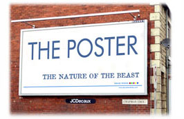
In the media world, all posters come under the overall umbrella of Outdoor , even though the poster may actually be Indoors (i.e. The London Underground, shopping malls) but they are still Outdoor and we won't argue with them.
As with press ads, to ensure posters are as effective as possible we need to understand the nature of the media, the environment in which they exist - and basically how the audience may (or may not) see them AND ensure they are in the right position, a 'prime location', meaning a high visibility position AND in a location that is relevant to your target audience, product, brand, message and requirement.
Unlike press ads, there are no circulation or readership figures available to help assess possible effectiveness and in the UK, Outdoor (or 'out of home' as it can be called) advertising figures are assessed by a research body called Postar (Poster Audience Research) who produce data based on the 'opportunity to see' and then adjusted by 'eyes-on' information and web-based interviews.
So what sort of posters are available - and what are their pros & cons?
Roadside Billboards. 16, 48 and 96 sheets and now a variety of technical formats from simple printed material to back-lit images, and even exciting, 'electronic' digital, animation and video technology.
Shopping Mall & Station Posters. Now a plethora of shapes, sizes and new technology from standard printed 4 sheets to electronic banners.
Railway Posters. Small and large format platform and walkway posters (printed, backlit & digital), in-train posters, tube cards, escalator panels.
Bus Advertising. Bus backs & sides, complete wraps, interior cards. Can be purchased by total fleet or individual route.
An important feature of Outdoor media is that unlike other advertising, it isn't exactly 'stationery'. Either the audience is moving (on trains, cars, pedestrians) or the media itself is moving (on buses, taxis, escalators) and even the odd exceptions ('in-train' posters) the audience is still 'temporary' and perhaps otherwise engaged (reading newspapers).
This has an enormous affect on the content of the poster. Headline and imagery must be simple and there is no place for long copy or complex messages. The connection between audience and poster isn't long enough to take that in.

I've seen platform posters on the London Underground that contain the equivalent of a large chunk of The Old Testament in copy (you'd have to let 3 or 4 trains go by to read them) and, equally bizarre, totally forgettable 'call to action' telephone numbers and web addresses on posters beside the 70mph A1 (expecting, I assume, you to pull over and jot it down!).
A strong opportunity with Outdoor media is in using the situation and position of the poster for its own ends giving a powerful and immediate connection (see the Immoeuro and One posters).
Great posters get a simple, strong message across...quickly