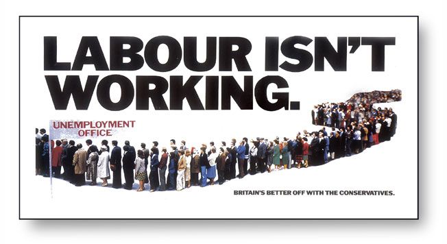
CLIENT: THE CONSERVATIVE PARTY
Typography, design & artwork
Hardly recent, and perhaps not a piece of work I'm particularly proud of (aesthetically, it isn't brilliant)
but it is more
of a great 'dinner party' conversation piece! It was famous, iconic and helped bring down
a Government.
There was always a bit of a mystery as to who wrote those 3 famous words (it was actually a writer named
Andrew Rutherford) and the poster was originally rejected by Charles Saatchi. The poster was secretly
're-inserted' into the presentation to Margaret Thatcher (then, leader of the Opposition) who, apparently, stopped
the meeting, stared at
the poster and said "wonderful".
I always thought that the image was technically quite awful (a group of 20 or so Young Conservatives in a car park near Hendon, and not "Satchee" employees as the Labour Chancellor Denis Healy claimed) but the quality was governed (excuse pun) by the lack of time & budget and the facilities available then (i.e. pre-Mac).
The poster subsequently won countless awards (D&AD, British Poster Awards etc) but importantly, and amusingly, was voted by Campaign magazine and a jury of famous advertising luminaries as The Best Poster of the 20th Century.
Could you pass the salt?