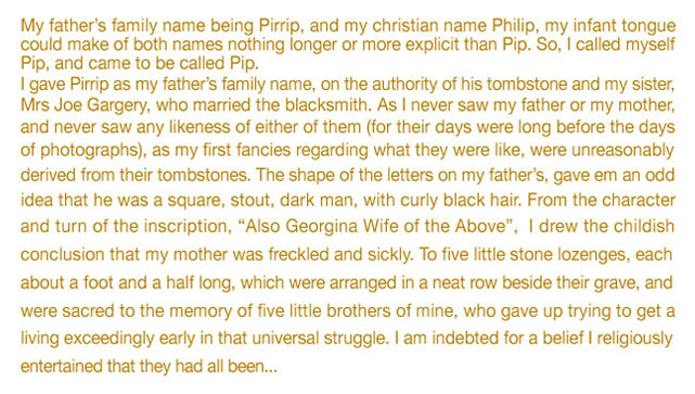
Or line 'spacing' (once known as 'leading')
Line feed can make an immense difference to both the 'feel and flavour' of type, and to the overall legibility.
Line feed was once known as 'leading' because originally, when type was set by hand, the typesetter would add lead strips (known as reglets) between the lines of type, usually in 1 point thicknesses, to open up the feed.
When type is set 'solid' (i.e. without any extra line spacing) the text appears cramped and difficult to read, so the typographer will add extra line feed, which adds more 'white' between the lines, making it easier for the eye to naturally track the words from one line to the next.
The amount of line feed added depends on a number of factors - such as the typeface itself (some have long 'ascenders and descenders') the tracking (inter-character spacing) and importantly the line length.
Indeed the line lengths on this section of this very website are quite long (out of design necessity) so the character spacing is deliberately quite loose, and the line feed is quite open (9pt on 12k) plus there is extra paragraph spacing, making the longish text easier to read.